Interactive Design | Project 1: Prototype Design
26.09.2023 - 03.10.2023 | Week 5 - Week 6
Zoë Lena-maria Nelson | 0364991 | Rotterdam University Of Applied Science
Interactive Design | Project 1: Prototype Design
Requirements
In this first part of the assignment, the student will focus on creating a UI design prototype for their digital resume or curriculum vitae (CV) using prototyping software such as Adobe XD or Figma. The UI design prototype will showcase their digital resume's layout, visual elements, and user interface interactions. For this project I used Adobe XD.
Objectives:
- Content and structure
- Layout and Visual Design
- Section and organisation
- Visual Elements
- Prototype Presantation
Evaluation: Your UI design prototype assessment will be evaluated based on the following criteria:
- Clarity and effectiveness of the UI design, layout and visual elements.
- Appropriateness of the chosen typography, colour palette and imagery.
Project 1
Content and structure
To start with a good structure, I first had to find out what a 'good' structure is for me. I researched the design of resumes and found out that I would like to go with a simple, modern and slightly coloured resume. That is why I will use colours, lines, and graphic design in the layout minimally.
After doing my research, I created five drafts to find out what my style and hierarchy of sections will look like. To make this resume, I had to have a few things in mind, which are mandatory for this project, including personal details, education, work experience, skills, projects, and other relevant sections such as contact.
It is essential to put personal details on the page. The reason is that the reader will learn something about the person who sent the resume, directly knowing someone. After that, you can see the education and the experience. I choose to do this because this is why someone checks your resume in the first place. Therefore, it is essential that the education and the work experience can be seen in the middle of the page in the blink of an eye.
After that, I included 'Project' so the reader has follow-up and direct results I achieved during my education and work experience. I would love three results you can navigate to to choose the next project to view. Then, I will add my Skill set in Adobe to showcase where I am regarding my skill level.
Last but not least is the contact information. I found that the contact information belongs on the end of the resume because it is easy to find. It is easy to find because most of the websites and contact info can be found at the bottom of the page when you are informed about the website or, in this case, the person.
In the end I choose for Figure 5. because this is the one I found the best in layout and has the best visuel view.
Figure 1.
Figure 2.
Figure 3.
Figure 4.
Figure 5.
Layout and Visual Design
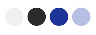
When putting together my resume, I opted for the font Lao MN as it provides a neat and refined look. To convey a sense of reliability and professionalism, I used the color blue for headers and titles. On the other hand, I incorporated purple, which is associated with sophistication and originality, as accents or highlights to make my resume stand out and highlight my individuality. Throughout the document, I maintained consistency in my font and color choices, ensured appropriate spacing, and most importantly, focused on creating clear and concise content that meets the expectations of the industry and the job I am applying for, resulting in an impressive and effective resume.
Figure 6.
Sections and Orginazation
I've structured my resume into logical sections to present my qualifications and background to potential employers. The sections include "About me," "Education," "Experience," "Skills," "Projects," and "Contact." Each section serves a specific purpose. "About me" gives a brief introduction, "Education" showcases academic achievements, "Experience" details work history, "Skills" highlights relevant abilities, "Projects" demonstrate practical applications, and "Contact" offers an easy way for employers to reach out. This structured format makes it easy for recruiters to quickly find the information they need and understand my resume.
Figure 7.
Figure 8.
Figure 9.
Figure 10.
Visual Elements
In my resume, I chose to use only three symbols to provide my contact information: a phone icon, an email icon, and a LinkedIn icon. This was done to maintain simplicity and ensure clarity for the reader. Using symbols makes it easy for potential employers to quickly identify and access my contact details without cluttering the document with lengthy text.
For my profile picture and project images, I opted for visual elements. I believe that visual elements can be powerful in showcasing my personality and work. A picture of myself adds a personal touch and allows potential employers to put a face to the name. Images for projects can visually represent my accomplishments, making them more engaging and memorable for the reader. This approach ensures that my resume not only provides essential information but also leaves a lasting impression through effective use of visuals.
Figure 11.
Summery
When creating my current resume, I made intentional decisions to enhance its visual appeal and professionalism. I chose the Lao MN font for its elegant appearance and incorporated the colors purple and blue. Additionally, I simplified my contact information with three symbols and added images for my profile picture and project representations to add a personal touch and engage the reader visually. Moving forward, I will prioritize clarity and readability in my design choices, while keeping in mind industry expectations. To ensure the best outcome, I will seek feedback from peers, proofread meticulously, and customize each resume for specific job applications. My goal is to create impactful and well-designed documents.


Reacties
Een reactie posten