30.08.2023 - 06.10.2023 | Week 1 - Week 6
Zoë Lena-maria Nelson | 0364991 | Rotterdam University Of Applied Science
Design of Principles | Task 1: Exercise
Introduction to Module
Submission Assignment:
1. Exercises blog link,
2. JPEG image of each final design (EACH labelled as <Your
Name_Selected Design Principle>)
3. PDF of Exercises blog
Learning Goals:
1. To describe the understanding and knowledge of design principles.
2. To demonstrate the understanding and knowledge of design principles
in work of design.
Main Goal:
Visual communication is about utilizing design to convey powerful messages to a target audience. As such the design must be well thought-out and executed. To achieve effective communication through design, it is important to learn about, and apply the elements and principles of design.
TAKS 1: EXERCISES
LECTURES
Introduction: Design is not only about how a product fancy's our eyes, but also about informing us what the product is about. It is an important to learn about the
a. Elements of design; point, line, shape, form, texture, space, and color.
These are the individual building rocks.
b. Principle of design: contrast, balance, emphasis, rules of third, reputation/pattern/rhythm, movement, hierarchy, alignment, harmony, unit and proportion.
These are organizational fundamentals that result from/or guides, the arrangement of the elements.
INTRODUCTION
During the first lecture, it was explained to us that we are learning that the same principle rules. And the different techniques we can use. For the first exercise or task one we can select three design principles from the following list:
1. Gestalt theory
2. Contrast
3. Emphasis
4. Balance
5. Repetition
6. Movement
7. Harmony and Unity
8. Symbol
9. Word and image
1) RECAP OF SELECTED DESIGNWhile exploring the different design principle options and also listening to the lecture, I began to look and get inspired by the different design principles. Therefore, there were already a few that I had in mind to create some work, with those may be Movement, Contrast, Balance and Gestalt theory.
A. Movement: Your eyes move around a picture as a design element called movement. It occurs when objects in an image appear to be moving. Utilising various forms, lines, and curves in your design will help you achieve this movement.
Example: Consider yourself admiring a painting of a river with several boats on it. The boats' locations and faces create movement in the image, as does the river's curved shape. Your gaze may travel along the river from one end to the other when you stare at it, and it may appear as though the boats are moving with the river. Therefore, in this instance, the painting is made to move by the way the river and boats are designed.
B. Contrast: To contrast is to combine quite dissimilar things. It would be monotonous if everything had the same appearance. Contrast adds curiosity, draws attention to crucial details, and gives things deeper significance. Visual experiences that accentuate a point can help you see this.
Example: Contrast enhances visual excitement. It aids in making crucial things visible. Contrast is used to tell you, for instance, "This word is important!" while you're reading a book and an essential word is in large, dark characters while the remainder is in small, light letters.
C. Balance: Balance in art or design refers to how things appear balanced or even in a picture. This is similar to when you want your see-saw to be level when you have one. In order for a piece of art to seem excellent as a whole, each component should feel important and distinct.
Two different methods exist for doing this:
1. Symmetrical Balance: This is when your image is balanced so that the same elements are on both sides, almost like a mirror image. It's comparable to a seesaw with the same amount of weight on both sides.
2. Asymmetrical Balance: Although there are different elements on each side of the frame, the balance is still apparent. It's level, but it feels like the seesaw has a large boulder on one side and a couple lesser rocks on the other.
D. Gestalt theory: Gestalt Theory is a method for understanding how our minds tend to make sense of the world. It's similar to how we recognize patterns or shapes in stars or clouds. "Gestalt" is the German word for form or shape. Gestalt Theory therefore, provides a set of laws that serve to describe how our eyes perceive things. These guidelines demonstrate how to dissect complicated images into smaller, more manageable parts. Additionally, they clarify why our eyes perceive all of those components as a single whole rather than as a number of disparate components.
Example: Think about viewing a smiling face in a picture. Your brain interprets it as a single happy face rather than as individual lines and contours. This is due to Gestalt principles, which help us comprehend how our brains ordinarily classify objects.
2.1) Visual ReferenceMovement:
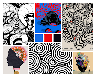
Figure 1.1.
Balance:
Figure 1.3.
Figure 1.4.
Gestalt Theory:
2.2) Exploration and Description
MOVEMENT:
I have chosen movement because the first thing that came to mind was dyslexia. I want to show how not only dyslexia but also the Neurodivergent mind can be seen in an artistic form. Therefore, the movement to show the complexity of a brain would be very interesting to show. As I was creating my art, I found myself changing my mind and wanting to explore movement on an other level. I started with a lowkey form of repetition to ease myself into it. This approach will allow me to fully express the different levels of the various movements.
Version AFigure 2.3.
While exploring the principle movements, I was really interested in giving the brain a wavy texture, as seen in Figure X in the visual references. While creating this drawing, I found out that this image is way out of my league and then I got the idea of movement in the body. And what better way to present that as a dancer?
Version B
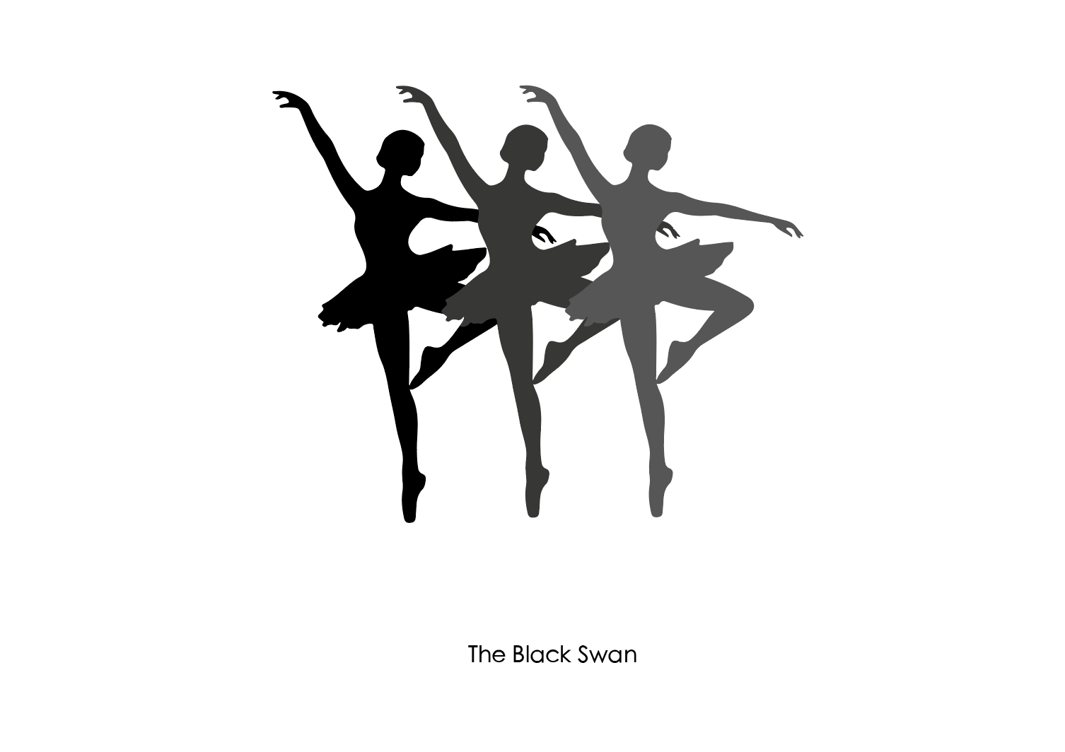
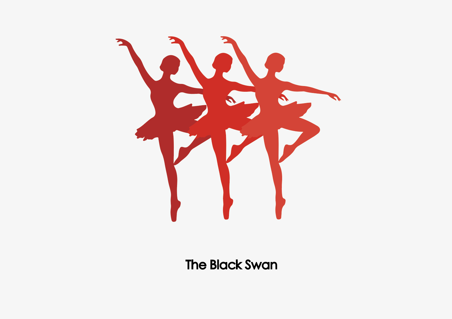
Regarding Version B, I delved deeper into the principle of movement. I aimed to achieve a greater sense of movement by incorporating multiple silhouettes, as inspired by Figure 1.2. To choose the appropriate silhouette, I searched for images of dancing that conveyed the idea of movement. The most fitting example for me was the silhouette of a ballerina.
After reviewing visual references, I began exploring colours and shapes. The movie "Black Swan" inspired me to add the title of the poster for the movement.
2.3) Finale version Movement
The rationale behind my work on Version B was to create a visually engaging image that conveyed a sense of movement. Drawing inspiration from various sources, as seen in Figure 1.2., I incorporated multiple silhouettes and experimented with different colours and shapes of the Ballerina. By giving each silhouette its unique motion, I achieved a dynamic and captivating final product that effectively captures the essence of a dancer's movement, leading to the Design Principle Movements.
BALANCE:
The first thing that came to mind when hearing and seeing the design principle of balance was a relationship considering love. I think any stable relationship, whether it's your family, your friends, or your loved ones it should be balanced. Therefore, I want to show a balanced relationship with love. During my review of the images, I was struck by the mesmerising hand movements that I observed. These movements provided me with inspiration and creativity to represent balance.
Figure 4.1.
While creating balance, I decided to pay tribute to the principles of contrast by emphasising the red circle.
Figure 4.4.
2.3) Finale Version Balance
In creating this piece, I focused on achieving a balance between different elements while also incorporating a hint of contrast. This design principle of balance allowed me to effectively capture the idea of a healthy and stable love and relationship, while the addition of contrast added interest and depth. The use of both symmetrical and asymmetrical balance, as well as the contrasting red circle, creates a dynamic and visually appealing piece that captures the essence of balanced love.
GESTALT THEORY:
While getting inspired and making this mood board, I slowly shifted my inspiration from contrast gusto theory without knowing. Therefore, I want to combine the Gestalt and contrast by using Pices and a Dragon. Therefore, I can present my horoscope and combine my Westin horoscope with my Chinese New Year animal. But while creating, I found out that I wanted to shift te focus on Disney and Gestalt which I prefer more since my family loves Disney so much.
Version A
Figure 5.1.Figure 5.2.Version B
Ultimately, I found inspiration in the way the pencil-shaped the image of the woman. Therefore, I got inspired by the shape of the woman creating a form with her feminine features. Let's just see her bikini line. But then again, I got really inspired by a woman having her period and the blood could be an example of her. But also of red wine.
While creating the shape, I was inspired by the legs of the woman figure to make it look like a martini glass, resembling a glass of wine.
2.3) Finale Version Gestalt Theory
This artwork is an example of the Gestalt principle of figure-ground perception. The female figure is clearly defined against the white background, and the viewer's eye is drawn to her form and the details within it. The use of colour, specifically the drop of red wine, adds emphasis to the focal point of the artwork. Additionally, the martini glass shape created by the legs of the figure serves as closure, allowing the viewer to complete the form in their mind. Overall, this artwork effectively utilizes the principles of Gestalt theory to create a visually appealing.
2.4) Feedback from lecture
MOVEMENT: During my recent lecture, the instructor provided me with valuable advice pertaining to my poses in the performance. In addition to reusing poses, I was also advised to incorporate movement to enhance my overall presentation. Taking their guidance into account, I diligently followed their recommendations. The lecture taught me that for animation, I should reuse the same frames and create movement. In the end, that's what I did.
GESTALT THEORY: I experimented with various designs for the Gestalt Theory project, but ultimately the instructor specified that it needed to incorporate two illustrations in one. As a result, I modified the shape to resemble that of a woman. However, I received feedback suggesting that it didn't resemble a glass shape, so I revised it to look more like a martini glass. This way, the shape of a wine or martini glass is clearly visible in the design.
2) REFLECTION
I recently completed the first six weeks of the Design Principles course, where I explored and applied various design principles, including Gestalt theory, contrast, balance, and movement. These principles are crucial in visual communication, and I gained a deeper understanding of design through my experiences. In this reflection, I will discuss my journey, inspirations, and the evolution of my work related to these principles.
Movement was an exciting principle to explore, and I initially wanted to represent the complexity of the neurodivergent mind. However, as I progressed, I broadened my focus to explore movement in a wider sense. I experimented with different forms and repetitions to convey the dynamic nature of movement, and I particularly enjoyed exploring the graceful motions of dancers. Through visual references and exploration, I created a final piece that effectively captured the essence of a dancer's movement. This exercise taught me the importance of using design elements such as form, line, and repetition to create a sense of movement in a composition. It also emphasized the need for flexibility in the creative process as my initial idea evolved into something more dynamic and visually engaging.
When it came to the principle of Balance, I was inspired to explore the concept of balance in relationships, particularly in the context of love. I aimed to convey the idea that a healthy relationship should be balanced and stable, much like a well-balanced see-saw. The mesmerizing hand movements I observed served as a source of inspiration for my work. During the creative process, I also incorporated elements of contrast, emphasizing a red circle to add depth and draw attention to important details. This exercise taught me the significance of achieving balance in the composition and the thematic message it conveys. It emphasized the importance of using visual elements strategically to convey meaning and emotion.
My exploration of Gestalt theory led me to a unique blend of contrasting concepts – Western horoscope signs and Chinese zodiac animals, eventually shifting my focus to Disney characters. My initial idea was to merge these elements into a single design, but I found myself more inspired by the shape of a woman, resembling a glass of wine or martini. Through experimentation and adaptation based on feedback, I refined the concept to ensure the martini glass shape was more apparent, aligning with the Gestalt principle of figure-ground perception. This exercise reinforced the importance of feedback in the creative process and the need to adapt and refine ideas to communicate a concept effectively. It also showcased the power of symbolism and the ability of design to convey multiple layers of meaning.
In conclusion, my journey through these design principles – Gestalt theory, contrast, balance, and movement – has enriched my understanding of design as a means of effective visual communication. I learned to be adaptable, seek inspiration from diverse sources, and use design elements strategically to convey messages and emotions. As I continue my studies in design, I am excited to apply these principles to create compelling and meaningful visual narratives.







Reacties
Een reactie posten